“I just needed something simple that helps me stay on track. Healio does exactly that”

Healio is a mobile app designed to support users recovering from shoulder injuries by providing a structured, motivating, and easy-to-use platform for rehabilitation. The app combines progress tracking, daily logging, physiotherapy exercise guidance, and stress-relief tools to help users stay consistent throughout their recovery.
Its core features include visual progress dashboards, a customizable exercise program, a daily diary for pain and habit tracking, and guided meditation to reduce stress during rehabilitation. Together, these tools create a clear and accessible experience that simplifies the recovery process while ensuring users always know what to do, how they are progressing, and how to stay motivated over time.
Persona
“I wish I had a simple way to keep track of my exercises.”

Chris Harper
Age: 37
Occupation: Designer
Background: Former national competitive swimmer who recently suffered a shoulder injury and underwent surgery.
Digital literacy: Tech-savvy, enjoys exploring new apps.
Habits: Uses apps for tracking mood and routines, exercises regularly.
Personality: Motivated, goal-oriented, stays positive but can become frustrated by slow progress.
Goals & Motivations
Recover full shoulder function as quickly as possible
Have a simple and clear way to track recovery
Receive reminders for physiotherapy exercises
Challenges & Frustrations
Forgets exercises during a busy day
Frustrated by uncertainty about recovery speed
Shoulder pain affects work efficiency
Stressed by the length of the rehabilitation process

Ideation
The ideation phase focused on exploring how Healio could support users recovering from injuries through motivation, clarity, and simple daily routines. Using insights from research and early user needs, we generated multiple concepts around tracking recovery progress, guided exercises, and accessible self-reflection tools.
Our brainstorming sessions revolved around three key questions:
How can the app reduce uncertainty during recovery?
How can it support consistency without overwhelming the user?
How can we make the experience feel encouraging rather than clinical?
From this, several core ideas emerged:
Daily Check-ins to help users monitor pain levels, mobility, and overall wellbeing with minimal effort.
Exercise Library with clear demonstrations and step-by-step instructions tailored to different injury types.
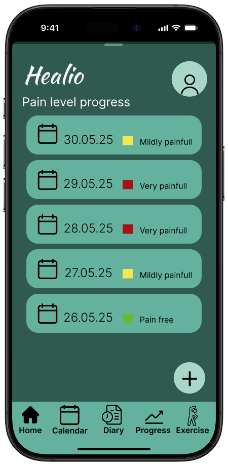
Progress Visualization showing small improvements over time to keep users motivated.
Educational Insights that explain why each exercise matters and how it supports healing.
Notifications and Reminders designed to feel supportive, not intrusive reinforcing healthy habits.
Simple and Calming Visual Style to reduce stress and make the app feel like a trusted companion during recovery.
Through sketching, wireframing, and comparing ideas against user needs, we narrowed the concepts into a focused solution: a recovery app that combines simple tracking, guided exercises, and meaningful progress feedback. Healio aims to empower users like Chris to take control of their healing journey, one day at a time.
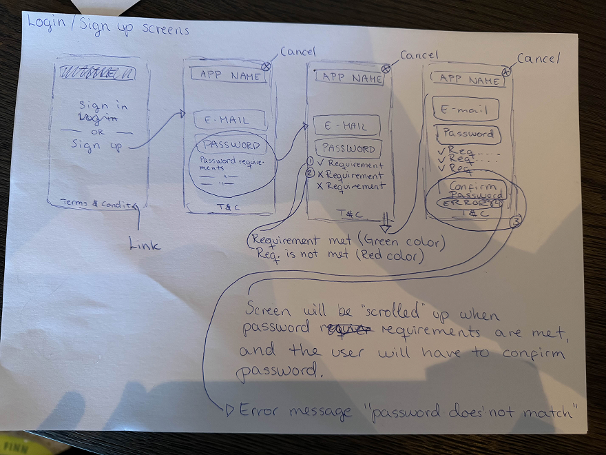
User flow
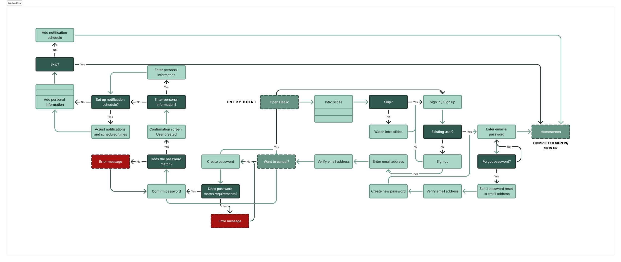
In the user flow for Healio, we focused on creating a simple and predictable path that supports users throughout their recovery process. Because injured users may experience discomfort, fatigue, or limited mobility, the flow avoids unnecessary steps and guides them directly to the core actions.
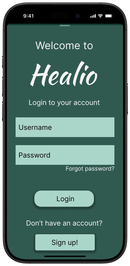
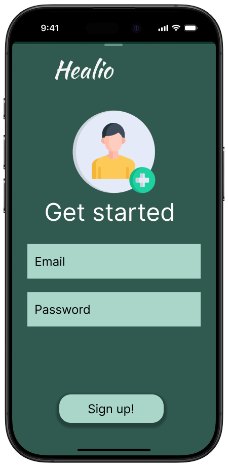
When opening the app, users are taken to a home screen that highlights the most important tasks of the day, such as completing the daily check-in or starting recommended exercises. This reduces decision-making and ensures a clear starting point.
The daily check-in is structured as a short, linear sequence where users log pain levels, mobility, and overall wellbeing. Each step is separated to minimise cognitive load, and the flow concludes with a concise summary of their input.
The exercise flow is equally streamlined. Users can browse simple categories, select an exercise, and access clear step-by-step instructions and visual cues. This helps them perform routines safely and confidently.
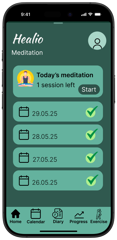
Additional flows such as viewing progress or accessing meditation content are intentionally minimal to keep navigation light and approachable. Overall, the user flow supports small, manageable interactions that can be completed consistently from day to day.
Information Architecture
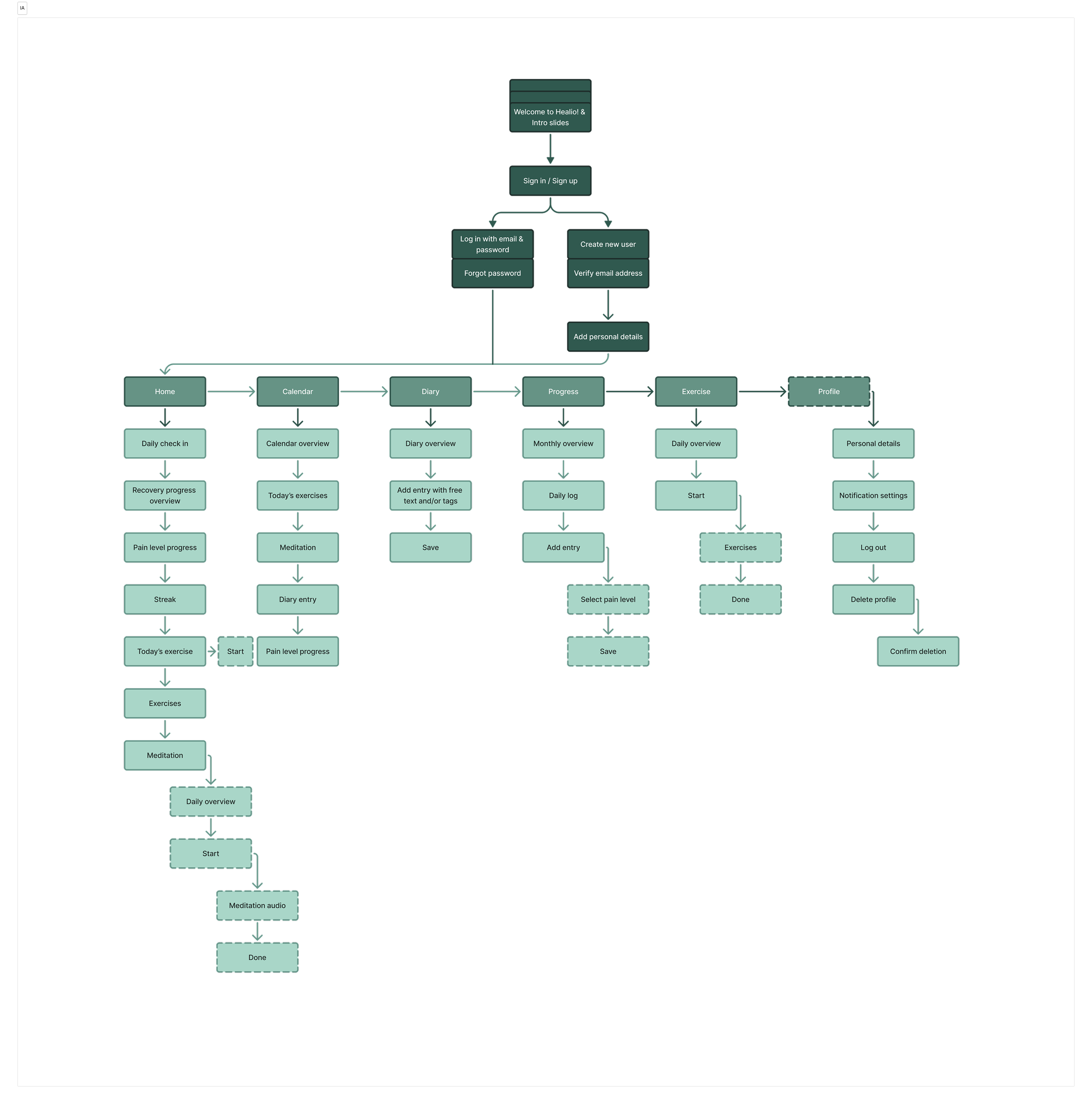
The information architecture of Healio is designed to be clear, structured, and low-effort to navigate. Because recovery can be demanding, the IA ensures that essential features are easy to access at all times.
At the highest level, the app is organised into four main sections: Home, Check-in, Exercises, and Progress, with meditation content included as supportive optional material. This top-level structure makes the app intuitive, giving each feature a distinct and easily recognisable place.
Within each section, the content is intentionally focused. The check-in area uses a step-by-step format to reduce overwhelm. Exercises are grouped into simple categories so users can quickly locate the routines they need. Progress information is presented in a clean, digestible manner without complex visualisations.
Consistency across screens reinforces this structure. Layouts, interaction patterns, and navigation elements follow the same logic throughout the app, helping users build familiarity and reducing the cognitive load required to move between tasks. This strengthens the overall experience and supports continuous engagement during recovery.
The design decisions for Healio were guided by the goal of creating a calm, supportive, and easy-to-use recovery experience. Each choice focuses on reducing cognitive load, improving clarity, and helping users stay motivated throughout their healing process.

Design choises

-
Healio uses a calm and balanced colour palette to create a sense of safety and motivation throughout the recovery journey. The colours are chosen to feel supportive while still making key elements stand out clearly.
Contrast levels are adjusted to ensure that text, icons, and interactive components remain easy to see, even for users who may be tired or experiencing discomfort due to injury. This improves accessibility and reduces cognitive load during daily use.
-
Readability is prioritised to help users quickly understand what to do without effort. Text sizes and spacing are designed to be clear and comfortable to read.
Call-to-actions are placed strategically, using short and direct language that makes the next step intuitive. CTAs use clear colour contrast and simple wording so users always know how to proceed—whether they are starting an exercise, completing a check-in, or viewing their progress. -
To build trust and familiarity, Healio follows a consistent visual and interaction pattern throughout the entire app. Navigation, iconography, colour usage, and components all follow the same rules across screens.
This helps users like Chris understand new features quickly because the app behaves predictably. Consistency reduces errors, supports learning, and allows users to focus fully on what matters: their recovery progress.
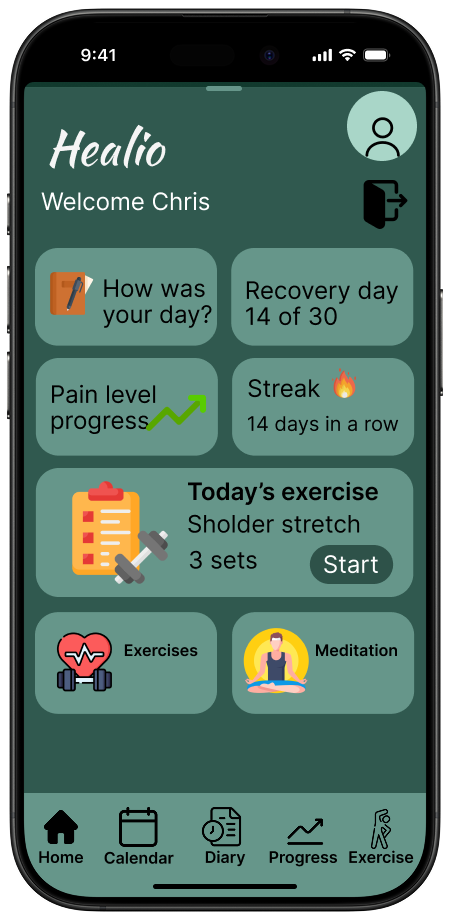
High-fi prototype
The high-fidelity prototype represents the final visual direction for Healio and demonstrates how the core features come together in a polished and intuitive interface. The design focuses on creating a calm and supportive experience, using a clean layout, soft colour palette, and clear visual hierarchy to guide users through their daily recovery routines.
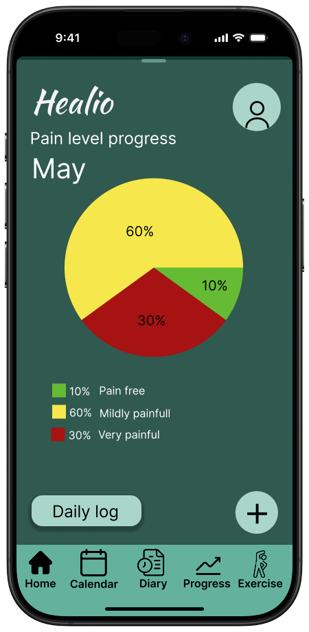
In this prototype, we refined the interaction patterns for the check-in flow, ensuring that each step feels simple and approachable. The exercise screens include structured instructions and visual guidance that help users complete their physiotherapy routines with confidence. The progress section displays improvements in a clear and encouraging format, avoiding overwhelming charts while still giving users meaningful insights into their recovery.
We also incorporated meditation content into the prototype as an optional resource for mental wellbeing, presented in a minimal and accessible layout. Throughout the screens, spacing, typography, and contrast were carefully adjusted to support readability and reduce cognitive load important considerations for users who may be dealing with pain or fatigue.
Overall, the high-fidelity prototype showcases a cohesive and user-centered design that reflects the full Healio experience. It translates the app’s functional goals into a visually consistent interface that is easy to navigate, supportive in tone, and aligned with the needs of users going through an injury recovery process.
Final solution
High-fidelity prototypes illustrate the final design direction for Healio and bring together all core features into a calm, structured, and supportive recovery experience. The interface focuses on clarity, ease of use, and reducing cognitive load essential for users managing daily routines during injury recovery.
Screens highlight a clean visual hierarchy with soft colours, generous spacing, and accessible typography. This creates a safe and motivating environment that helps users stay engaged throughout the healing journey. The daily check-in flow is refined to guide users step-by-step through logging pain, mobility, and overall wellbeing, ensuring that the experience remains simple and unintimidating.
Physiotherapy exercises are presented with clear instructions and visual cues to support correct execution and build user confidence. The progress view summarises improvements in a digestible and encouraging format, helping maintain motivation over time.
Meditation content is included as an optional resource for mental well-being, offering moments of calm that complement the physical recovery process. Across all screens, the design remains consistent, predictable, and aligned with Healio’s goal of supporting healing through clarity, structure, and positive reinforcement.
Overall, this final solution delivers a cohesive, user-centred experience that empowers individuals to track their recovery, stay committed to their exercises, and maintain motivation throughout the healing process.
Reflection
-
Wireframes:
I contributed to the wireframing process by helping create and consolidate all early drafts. This involved comparing different layout ideas, removing unnecessary complexity, and ensuring the structure supported a simple and intuitive recovery flow. By merging our sketches into one aligned direction, we ensured that the wireframes reflected the core features of Healio: daily check-ins, exercises, progress tracking, and meditation.Colour Palette:
I helped select the colour palette used throughout the app, focusing on calm, accessible colours that aligned with the goal of creating a supportive recovery experience. The colours were chosen to maintain readability, pass contrast checks, and support the app’s overall tone of clarity and calmness.Icons:
I selected the icon set used across all screens to ensure a consistent visual language. This included choosing icons with clear shapes, strong outlines, and a friendly appearance that matched the app’s purpose and accessibility requirements. The consistent iconography supports quick recognition and improves overall usability.Prototype:
I assembled all high-fidelity wireframes and created the final high-fidelity prototype. This included refining spacing, interaction details, and visual consistency across screens so the prototype aligned with our design decisions and accurately represented the Healio experience. -
A clear and structured concept was developed based on the core functions of the Healio app: daily check-ins, physiotherapy exercises, progress tracking, and meditation. Maintaining a focused scope made it easier to design an interface that felt calm, intuitive, and supportive. The flow for the daily check-in and the layout for the exercises were particularly effective, as these elements translated smoothly into a simple and user-friendly experience. Consistency across screens further strengthened the overall solution.
Contrast levels were adjusted to ensure that text, icons, and interactive components remain easy to see, even for users who may be tired or experiencing discomfort due to injury. This enhances accessibility and reduces cognitive load during daily use.
-
Balancing clarity with sufficient detail was one of the main challenges. As the app focuses on injury recovery, instructions, flows, and information needed to be simple while still remaining meaningful. Structuring the content in a way that reduced cognitive load, while retaining all essential steps, required several iterations. Achieving a design that communicated calmness without becoming overly minimal also required careful refinement.
-
The process highlighted the importance of prioritising simplicity when designing for users who may experience pain, fatigue, or reduced mobility. Features such as step by step check ins and guided exercises demonstrated how critical pacing, spacing, and readability are for this type of app. The work also reinforced how essential consistency is for building trust and maintaining an experience that is easy to navigate.
-
With more time, the prototype could have been expanded to include additional variations of the check in states, more detailed exercise flows, and a broader range of progress views. The meditation section could also have been further refined to explore how different types of content might support users during more challenging phases of recovery. More extensive testing of the flows could have contributed to refining the overall structure even further.
-
Item descriDaylio. (n.d.) Daylio – Mood Tracker and Journal App. Available at: https://daylio.net/ (Accessed: 2 June 2025).
Injurymap. (n.d.) Injurymap – Digital Rehabilitation App. Available at: https://injurymap.com/ (Accessed: 2 June 2025).
Kaia Health. (n.d.) Kaia Health – Digital Therapy for Musculoskeletal Conditions. Available at: https://kaiahealth.com/ (Accessed: 2 June 2025).
Noroff, (2025) Prototyping - Module 1. (Accessed: 18 May 2025).
Noroff, (2025) Prototyping - Module 2. (Accessed: 18 May 2025).
Noroff, (2025) Prototyping - Module 3. (Accessed: 25 May 2025).
Spoelma, T. (31.05.2021). Man in white crew neck shirt [Photography]. Unsplash. Available at: https://unsplash.com/photos/ux2LvytLQ-A (Accessed: 29 May 2025).
W3C. (2023). How to Meet WCAG (Quick Reference). Available at: https://www.w3.org/WAI/WCAG22/quickref/?versions=2.2 (Accessed: 1 June 2025).
WebAIM. (n.d.). Contrast Checker. Available at: https://webaim.org/resources/contrastchecker/ (Accessed: 31 May 2025).
Physiotools. (n.d.) Physiotools by Physitrack – Exercise Prescription Software. Available at: https://www.physitrack.com/physiotools (Accessed: 2 June 2025).
Recover Athletics. (n.d.) Recover Athletics – Prehab App for Runners. Available at: https://recoverathletics.com/ (Accessed: 2 June 2025).ption