“Because no one should miss out on help just because the system is too complicated”
Economic vulnerability in Norway is often not just about low income. It is also about lacking overview and access to support. Many people miss out on free opportunities and financial aid because information is scattered across websites, posters, and social media, and is often hidden behind complex language and bureaucracy.
Hverdagshelten is designed to solve this challenge by gathering all free offers and support schemes in one user-friendly mobile app. The platform provides clear and accessible information about local opportunities such as food distribution, cultural events, children’s activities, and municipal services. It also guides users through financial support with simple step-by-step instructions and reminders for important deadlines.
With a strong focus on usability, accessibility, and inclusion, Hverdagshelten makes it easier for people in vulnerable situations to find trustworthy and relevant information without barriers. By combining clarity, dignity, and community value, the app helps users reduce stress, regain control, and feel more included in society.
The overall goal is to make everyday life easier and more dignified by transforming fragmented systems into one simple and inclusive solution.
Persona
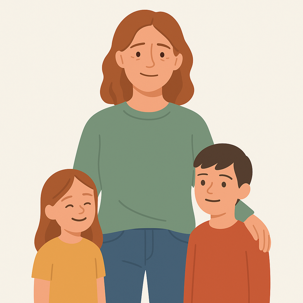
Maria is 37 years old and works part-time as a shop assistant. She is a single mother of two and lives in a rented apartment in Oslo. With a tight monthly budget, she often feels stressed as she tries to balance essential needs and meaningful activities for her children. Maria wants to provide stability and good experiences for her family, but limited time, resources, and complex systems make everyday life overwhelming.
Maria’s goals
Find free or affordable activities for her children
Gain a clear overview of what financial support she may be entitled to
Reduce stress and save time in her daily life
Maria’s frustrations
Information about support schemes is scattered across multiple websites and difficult to understand
She often misses important deadlines due to unclear or missing reminders
She feels ashamed when she has to ask others for help and wishes for a more dignified solution

Scenario
After paying rent and bills from her part-time job, Maria has very little money left for activities or unexpected expenses. She tries to stay informed about free local opportunities, but information is scattered across municipal websites, posters, and Facebook groups. One afternoon, she searches online for free food distribution at the local community center but cannot find updated information because the municipality’s website is confusing and difficult to navigate.
Later that week, she discovers a poster about a free children’s theatre event at the library — but the event already happened. At the same time, she receives a letter about housing benefits, written in bureaucratic language she struggles to understand. Without clear reminders or support, she forgets to follow up before the deadline.
By the end of the week, Maria feels overwhelmed, excluded, and unsure where to turn for help. She knows free activities and support schemes exist, but because the information is fragmented and hard to find, she consistently misses out.
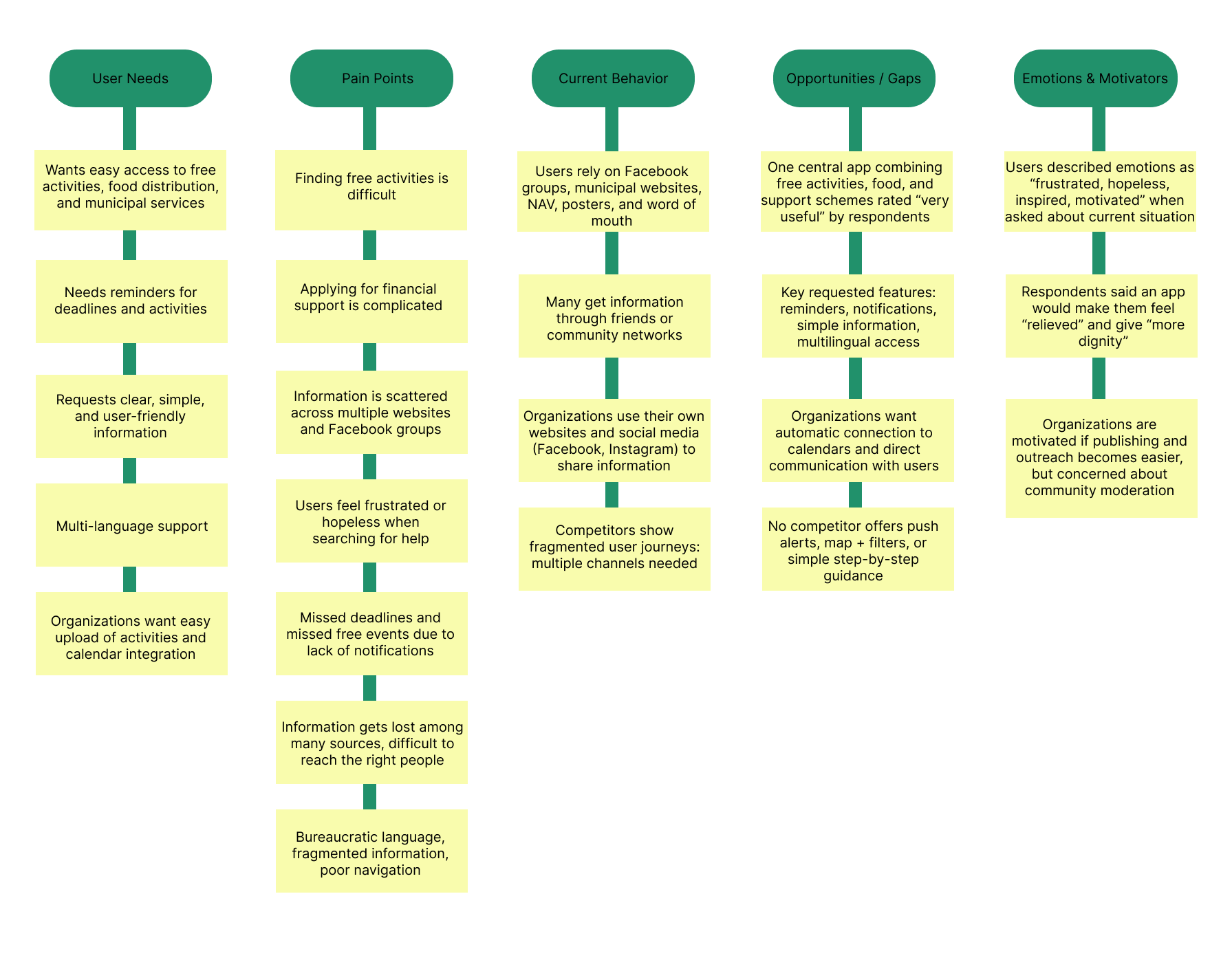
Research
To understand the challenges faced by people in financially vulnerable situations, the team began with an in-depth research phase. The goal was to uncover why so many individuals miss out on free services, support schemes, and important deadlines even when these opportunities exist.
All insights were organized using affinity mapping, which revealed strong themes:
High demand for reminders and notifications
Need for verified and trustworthy information
Preference for simple language and clear categories
Importance of map view and distance for everyday planning
Affinity Mapping
-
The team examined where users currently search for help: NAV, municipal websites, Facebook groups, and local posters. The analysis revealed that information is scattered, inconsistent, and often outdated, creating frustration and a lack of trust among users.
-
A digital survey uncovered clear patterns in users’ struggles:
Complex language and bureaucratic wording lead to confusion
Information exists everywhere — but nowhere in one place
Users need reminders, a calendar, and plain language
Many experience stress, exclusion, and guilt when they cannot find help
100% of respondents wanted one simple, unified platform
-
A literature review confirmed that financial vulnerability is often caused by lack of overview, digital barriers, and complex systems, not only low income.
Ideate
With a clear understanding of user needs, the team moved into ideation to explore solution directions.
-
Based on the insights, the team generated ideas such as:
A unified platform for all free services and support schemes
Clear categories such as Food & Essentials, Children & Family, Culture & Leisure
A map feature showing local activities and distance
Notifications and a calendar for deadlines
Step-by-step application help in plain language
-
The problem was defined as:
Users in financially vulnerable situations lack a unified, understandable, and trustworthy way to find services and support.
The vision became:
To create an app that provides dignity, clarity, and easy access to support in everyday life.
-
The chosen concept directly addressed the most pressing user pain points:
Fragmented information
Language barriers
Lack of reminders
Low digital literacy
These priorities shaped the foundation for wireframes and the app's overall structure.
The research and ideation phase made it clear that users like Maria and Ahmed are not lacking opportunities, they’re lacking overview, clarity, and trustworthy navigation. This insight led to the creation of Hverdagshelten: a unified, accessible solution designed to reduce stress and restore dignity in everyday life.
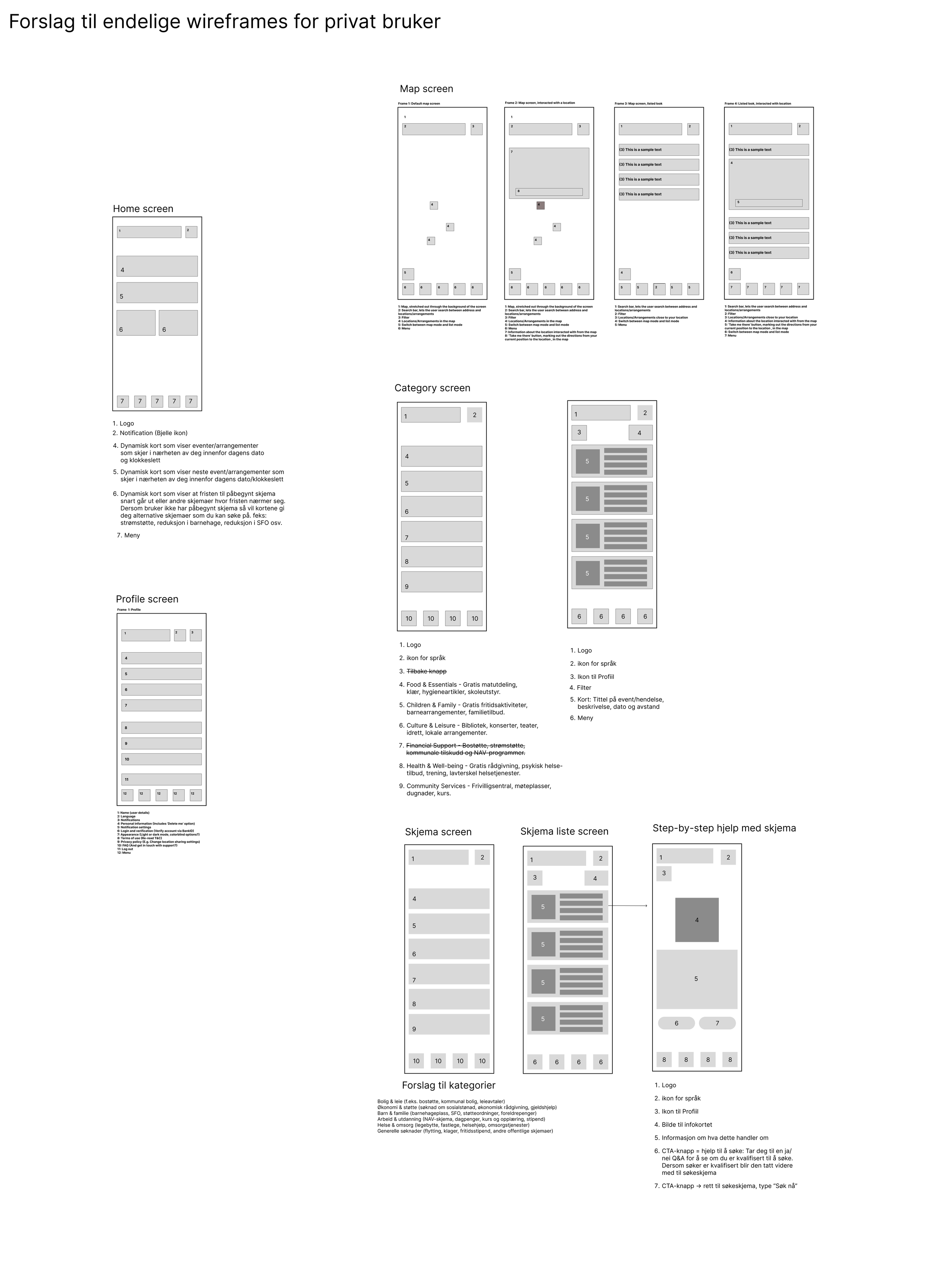

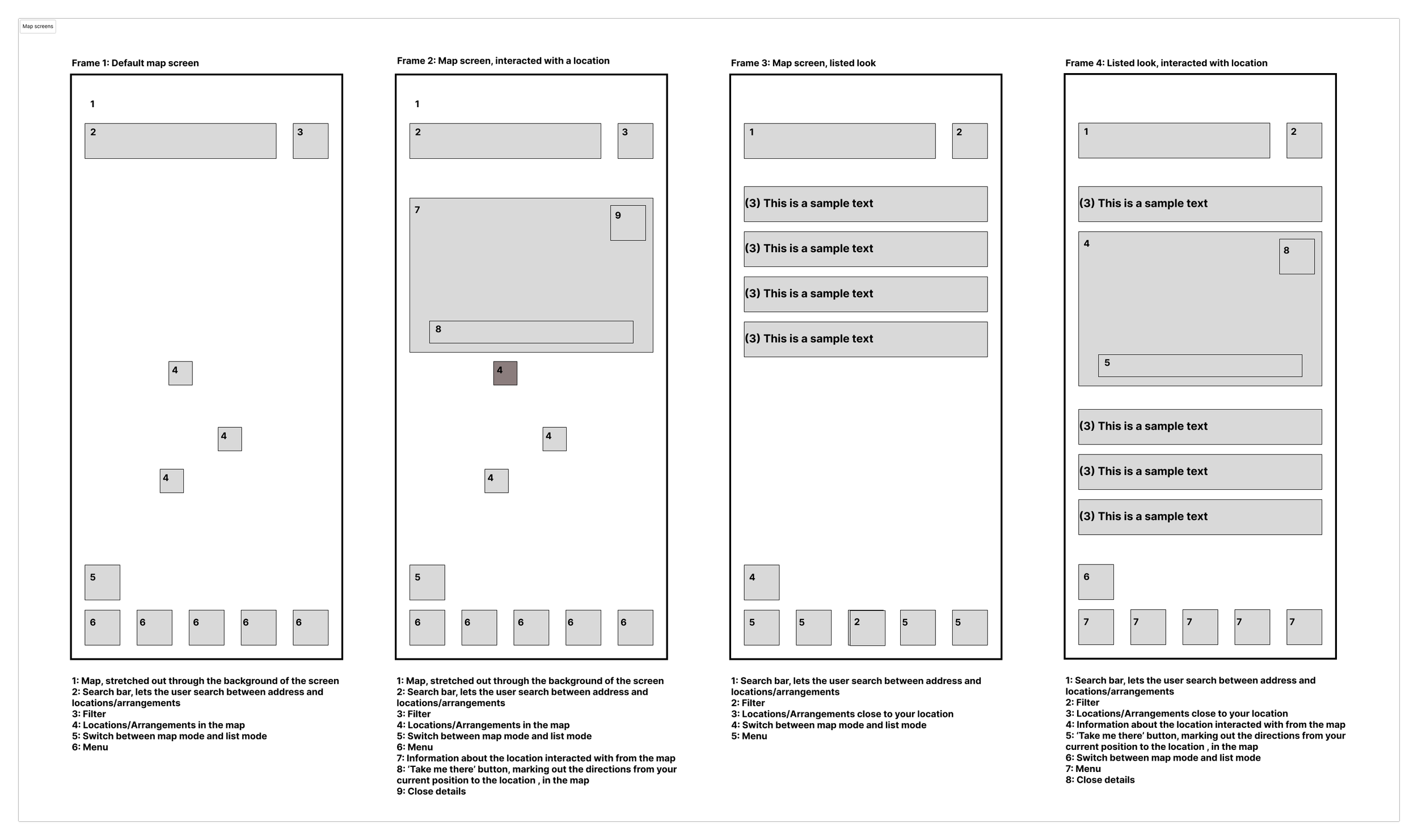
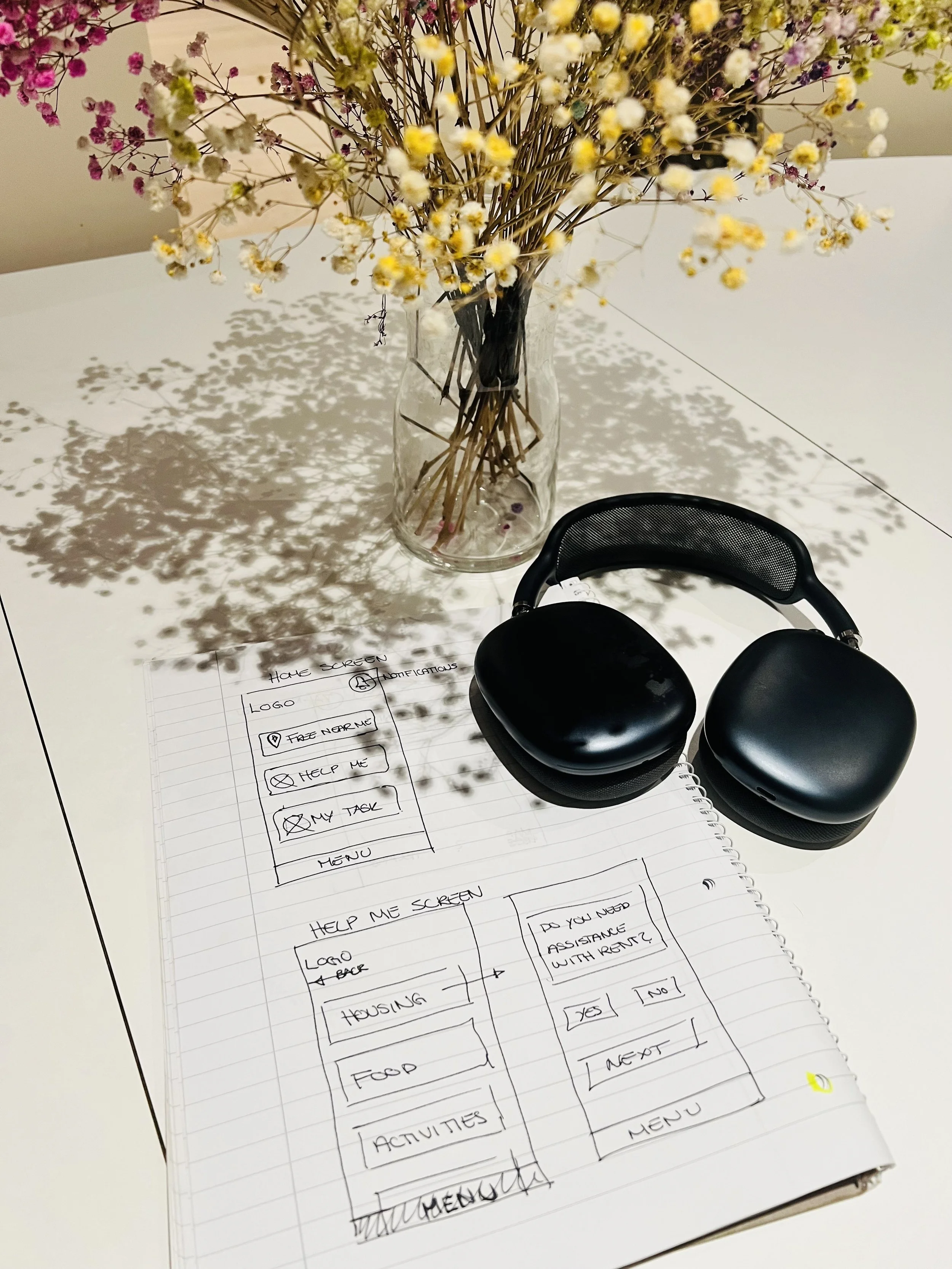
Low-fidelity wireframes

In the early phase of our design process, we developed low-fidelity wireframes to explore how Hverdagshelten could be structured in a simple, intuitive, and non-overwhelming way. The goal at this stage was not to define the visual style, but to test the overall structure, navigation, and information flow before moving into more detailed design work.
A central focus during this phase was to reduce cognitive load for users who often find themselves in stressful or vulnerable situations. Because of this, we worked with large, clear navigation elements, limited choices per screen, and an information structure that prioritised clarity and a sense of safety over complexity. We sketched how users would move from a simple starting point, gain an overview of relevant categories, and navigate into lists and detailed views without encountering unnecessary barriers.
The wireframes served as a tool for testing flow, not aesthetics. We used them to validate how categories, search, filtering, content cards, detail pages, and step-by-step guides could fit together into a natural journey that supports the users’ needs. This also included early ideas for features such as favourites, reminders, and map views, all designed to help users feel in control, supported, and informed throughout the experience.
By keeping the sketches low-fidelity, we were able to iterate quickly based on feedback and insights, ensuring that the core app structure was solid before moving on to high-fidelity prototyping. In this way, the wireframes became a crucial foundation for the rest of our design work, helping us ensure that Hverdagshelten was built on principles of clarity, accessibility, and dignity.
Information Architecture

As part of shaping the overall user experience, we developed a clear and accessible Information architecture that could support users who often face stress, uncertainty, or low digital confidence. At the same time, we wanted an IA that would work for the organisation behind Hverdagshelten: it needed to be maintainable, scalable, and flexible enough to include new services, partners, and support schemes over time.
We started by mapping out all content types from both a user and a company perspective: public support schemes, free local services, activities, practical guides, and ongoing processes that might involve multiple stakeholders (such as the municipality, NGOs, and other partners). From there, we grouped the information into intuitive, high-level categories such as Financial Support, Food & Essentials, Activities & Community, and Municipal Services. This structure makes it easier for users to find what they need, while also giving the organisation a clear framework for where new content should live as the service grows.
Throughout the IA process, we prioritised simplicity and long-term sustainability. We deliberately limited the depth of the hierarchy to avoid users getting lost, but we also defined a consistent taxonomy and naming convention that internal teams can follow when adding new content. This helps the organisation keep the app coherent over time and reduces the risk of duplicated, outdated, or scattered information.
We validated our IA through early sketches, task flows, and team walkthroughs, adjusting categories and terminology based on clarity, alignment with organisational goals, and how well it supported collaboration with external partners. This process helped us refine a structure that feels approachable for users, but also practical for the company behind Hverdagshelten supporting their ambition to be a reliable, dignified, and long-term hub for everyday help.
Design choises
Throughout the design process, we made a series of deliberate design choices that reflected both the needs of our users and the values of the organisation behind Hverdagshelten. Our goal was to create an experience that felt warm, trustworthy, and accessible
-
When designing Hverdagshelten, we made conscious decisions around contrast and colour to ensure both emotional warmth and functional accessibility. We chose a soft, calm colour palette to reduce stress for users who may already feel overwhelmed, but paired it with WCAG-compliant contrast levels for text, icons, and interactive elements. Key actions and CTAs use a high-contrast highlight colour, making them easy to spot without feeling aggressive or urgent. Backgrounds and cards use subtle shades to create visual separation without relying on heavy borders. This balance allowed us to support users with visual impairments while maintaining an approachable, friendly aesthetic.
-
We selected a clean, sans-serif typeface with generous sizing and comfortable line spacing to enhance clarity. Body text is kept short and scannable, often supported by icons or illustrations to strengthen understanding. Interactive elements such as buttons, chips, and list items were designed with large tap targets that meet and often exceed recommended touch guidelines. This reduces the risk of errors, particularly for users with reduced fine motor skills or those navigating the app under time pressure.
-
A key challenge in designing Hverdagshelten was ensuring consistency between the experience of private users and the operational needs of the organisation behind the service. To achieve this, we built a shared design language that aligns user-facing components with internal structures such as categorisation, naming conventions, and content modules. This means that what users see as a clear and intuitive interface is directly linked to a stable, maintainable backend framework for the company. Terminology, iconography, and component patterns remain consistent across both sides, helping the organisation keep the service coherent and reducing the risk of fragmented content over time. This consistency also supports onboarding of new partners and contributors, making it easier to maintain quality and clarity as the platform evolves.
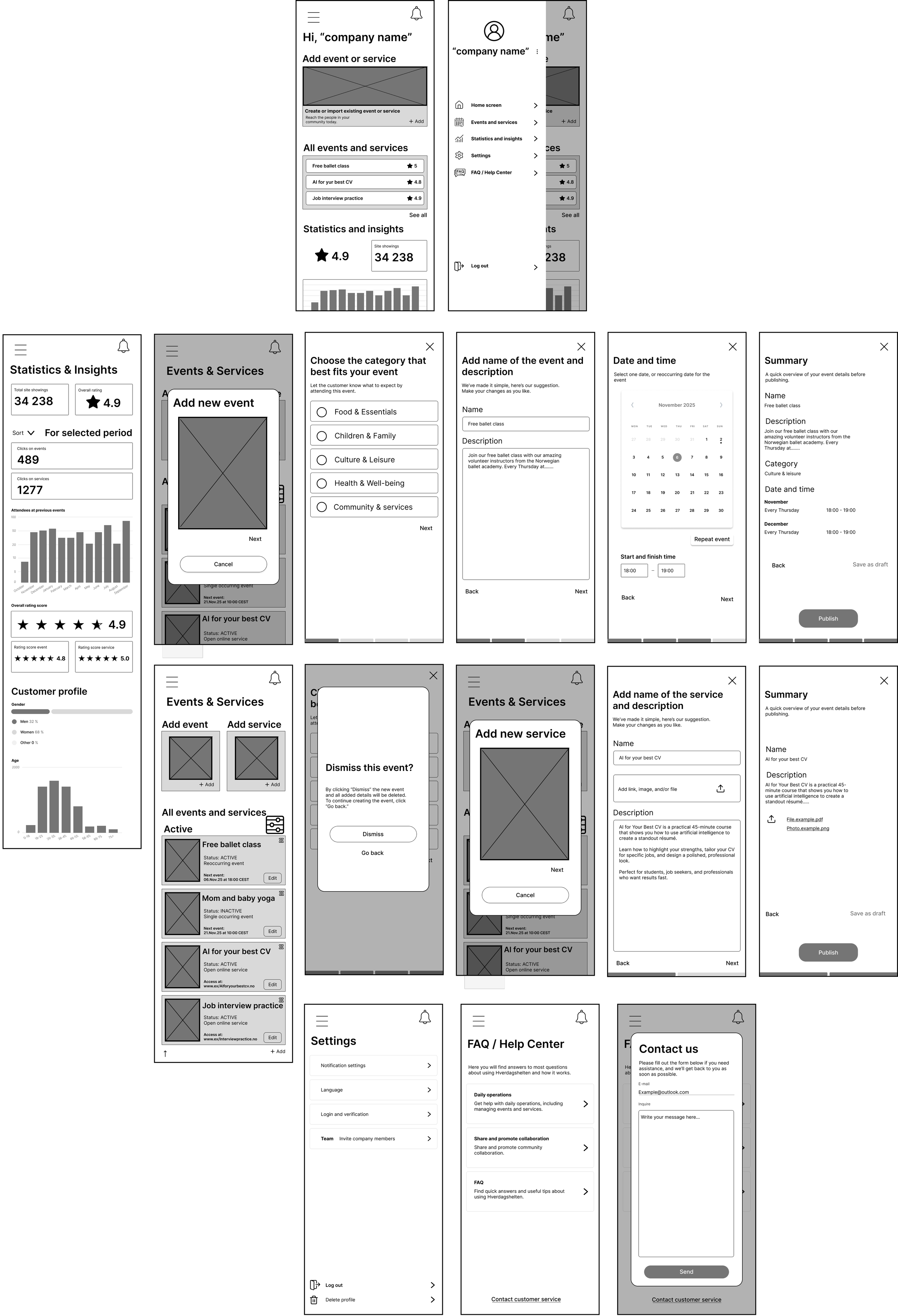
Low-fi → Hi-fi Development


-
High-fidelity prototypes formed the basis of our usability testing. By testing realistic screens rather than rough sketches, we gained insights into clarity, navigation, and emotional impact. During testing, we observed how easily users understood categories, interacted with step-by-step guides, and navigated between lists and details. Feedback from these sessions led us to refine terminology, strengthen hierarchy, adjust button placements, and improve the visibility of key actions such as saving items or accessing reminders. This iterative loop test, adjust, improve allowed us to ensure that the high-fi version wasn’t just visually cohesive, but also truly usable and supportive in real user contexts.
-
After validating our main flows through low-fidelity wireframes, we transitioned into high-fidelity development where our focus shifted from structure to expression. In this phase, we refined the visual identity of Hverdagshelten by introducing a calm colour palette, clean typography, and soft, rounded UI elements that promote a sense of safety and trust. We developed reusable components such as cards, buttons, and navigation patterns, ensuring that the interface was both approachable and consistent across the entire product. This visual refinement allowed us to move from abstract layouts to a more emotionally supportive and polished experience.
-
As we moved into the high-fi stage, we focused heavily on improving how users interact with the interface. We enhanced readability by fine-tuning font sizes, spacing, and hierarchy, ensuring every screen was scannable and accessible. Tap targets were expanded to support users with lower digital confidence, and we added high-contrast states, clear feedback indicators, and simple micro-interactions to guide users through sensitive tasks, such as applying for support schemes. These refinements ensured that the high-fi designs not only looked polished but also supported seamless, stress-free interactions aligned with our accessibility goals.
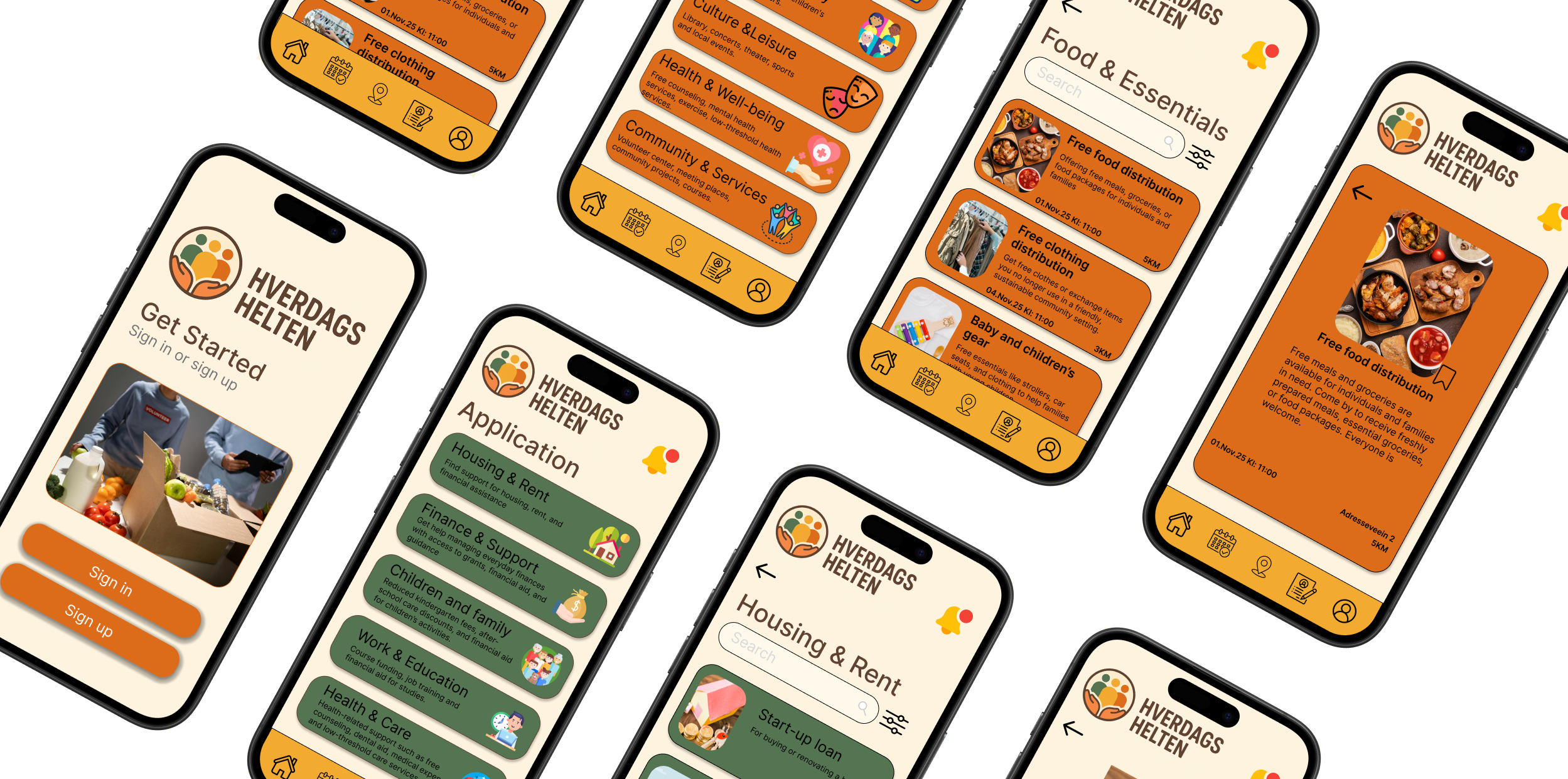
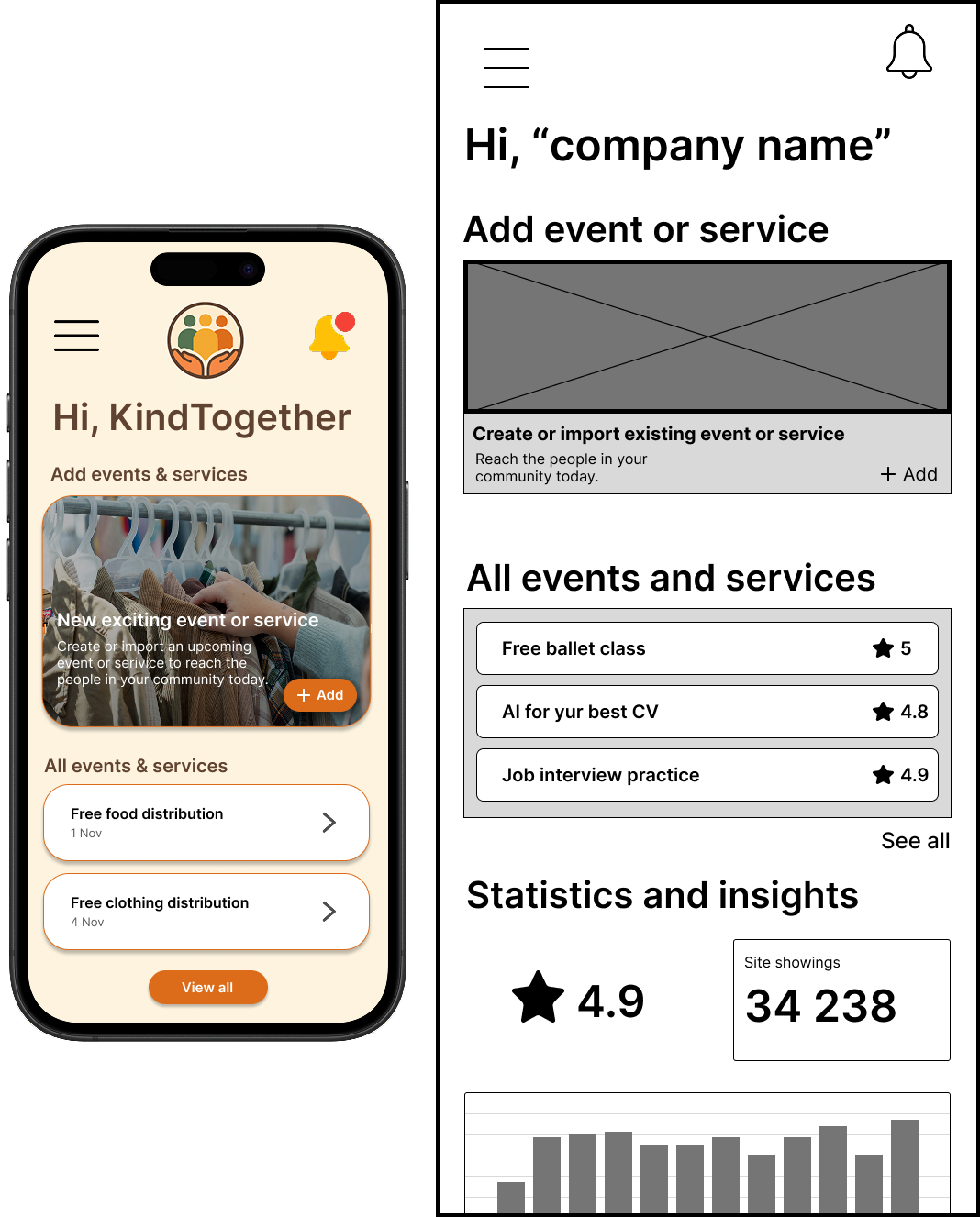
Final solution


“When information becomes easier to understand, help becomes easier to reach”
The high-fidelity prototypes represent the final visual design of the Hverdagshelten app, showcasing the refined layout, colour system, interaction patterns, and the overall consistency across the user flows. The focus throughout the final solution is on clarity, dignity, and reducing cognitive load for users who may already feel stressed or overwhelmed when seeking help.
The final design delivers a clean, calm, and intuitive experience that guides users smoothly through finding support schemes, local services, and step-by-step instructions. Soft colours, generous spacing, and clear hierarchy help create a sense of safety, while readable typography and accessible tap targets ensure that interactions remain effortless for users of varying digital skill levels. The interface maintains strong visual consistency across categories, lists, and detail screens, making it easy for users to recognise patterns and navigate with confidence.
The chosen design direction supports users in vulnerable situations by combining emotional warmth with functional simplicity. Key actions are highlighted with subtle but high-contrast accents, illustrations offer supportive context, and structured guides break down complex processes into manageable steps. Overall, the final solution provides a user-centred, accessible, and reliable experience designed to help people find everyday support with clarity and confidence, all while ensuring the platform remains scalable and maintainable for the organisation behind it.
Reflection
-
Scenario:
I created the scenario to clearly distinguish between our primary and secondary users. This helped establish realistic use contexts and clarified how different user needs should influence the design. The scenario guided our decisions throughout the process by grounding the solution in everyday challenges faced by people seeking free local services and support schemes.Wireframes:
I sketched the initial wireframes for Hverdagshelten, which we reviewed together as a team to compare structure, clarity, and usability. Through this collaborative process, we selected the versions that best supported the app’s goal of offering simple, intuitive navigation for users seeking free services and support schemes.
In addition to the early sketches, I assembled the complete set of high-fidelity wireframes, ensuring visual consistency, coherent layouts, and alignment with the chosen color palette, icons, and design patterns. This work helped establish a clear foundation for the final prototype and the overall user experience.User testing:
I conducted user tests with both private users and business users. This included testing the low-fidelity prototype to identify structural issues early and later evaluating the high-fidelity prototype to validate visual design, clarity, and navigation. The tests provided valuable insights into how users interpreted the content and moved through the app.Color palette:
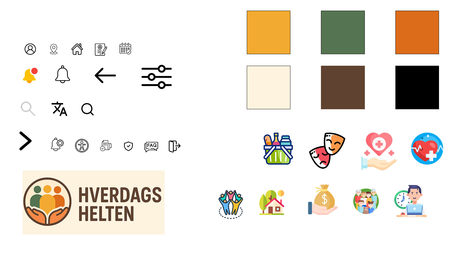
I selected the colors used throughout the design. The palette was chosen to create a trustworthy and inclusive experience while maintaining strong readability and accessibility. The colours reinforced the tone of Hverdagshelten—calm, supportive, and easy to navigate.Icons:
I identified recognizable icons used consistently across the app. The goal was to ensure quick comprehension, reduce cognitive effort, and create predictable navigation patterns. Selecting clear, universally understood icons helped make the app more accessible for users with varying levels of digital literacy.Affinity map:
I gathered feedback from user tests and organized it into an affinity map. This allowed us to identify patterns, pain points, and opportunities for improvement, making it easier to prioritize design decisions based on real user insights.Information architecture:
I created the information architecture for private users, ensuring we had a clear and structured overview of available services, support schemes, and navigation paths. The IA helped simplify complex information and supported the app’s goal of making it easy for users to find the help they need without feeling overwhelmed.Prototype:
I created the prototypes used in the user tests, setting up both the low-fidelity and high-fidelity versions for private users. These prototypes formed the basis for validating the structure, flow, and visual design of Hverdagshelten and ensured we could iterate based on real user feedback. -
Throughout the project, a strong focus on user centered design supported the development of a solution that addresses the needs of people in vulnerable everyday situations. An early emphasis on simplicity, clarity, and dignity guided both the structural and visual direction of the app. Low fidelity wireframes enabled quick validation of the core flows, while high fidelity prototypes supported refinement of the emotional tone and accessibility. Aligning user needs with organisational goals also contributed to a scalable and sustainable design system capable of supporting future growth.
-
One of the main challenges involved balancing emotional sensitivity with functional clarity. Designing for users who may feel stressed, overwhelmed, or unfamiliar with digital tools required continuous evaluation of language, hierarchy, and the amount of information presented at one time. Ensuring consistency between user needs and what the organisation can realistically maintain in the long term also presented a challenge. This required careful planning of information architecture, content patterns, and terminology. Visualising complex support processes in a way that felt simple without oversimplifying essential steps was another significant challenge.
-
The project highlighted how essential emotional design is when creating tools for people in uncertain or stressful life situations. Small design choices such as tone of voice, spacing, illustrations, and feedback states can significantly influence how supported and confident a user feels. The work also strengthened the understanding of accessibility, not only as a requirement but as a core value that informed layout, colour, typography, and interaction patterns. In addition, the project demonstrated the importance of designing with scalability in mind, ensuring that both users and the organisation benefit from a flexible and maintainable structure.
-
With more time, broader and more diverse usability testing could have been conducted, particularly with individuals who have varying levels of digital literacy or experience with public services. This could have supported further refinement of edge case scenarios and key stress points. Additional features such as multilingual support, personalised recommendations, or deeper integration with municipal systems could also have been explored. Finally, more time could have been invested in refining the design system to include component documentation, tone of voice guidelines, and patterns for future content expansion.
-
Flaticon, n.d. Open source icons. Available at: https://www.flaticon.com/free-icons/open-source (Accessed 22.11.2025).
Google Fonts. (n.d.) Inter. Available at: https://fonts.google.com/specimen/Inter (Accessed: 13 November 2025).Noroff. (2025) Accessibility (ACB). Available at: https://www.noroff.no/ (Accessed: 01. November 2025).
Noroff. (2025) Ideation and Planning (IAP). Available at: https://www.noroff.no/ (Accessed: 25. October 2025). ́
Noroff. (2025) Usability Testing (UT2) Available at: https://www.noroff.no/ (Accessed: 09. November 2025).
Noroff. (2025) Prototyping (POT). Available at: https://www.noroff.no/ (Accessed: 13. November 2025).
Noroff. (2025) UX Design for Mobile (UXM). Available at: https://www.noroff.no/ (Accessed: 27. October 2025).OpenAI. (n.d.) ChatGPT – used for generating illustrations, improving English phrasing, and refining written content. Available at: https://chatgpt.com/?model=auto (Accessed: 20 November 2025).
Pexels, n.d. Pexels - Free stock photos. Available at: https://www.pexels.com/ (Accessed 20.11.2025).
Statistics Norway (SSB), n.d. Norway’s 100 most populous municipalities. Available at: https://www.ssb.no/befolkning/folketall/artikler/norges-100-mest-folkerike-kommuner/tabell-1.norges-100-mest-folkerike-kommuner?utm_source=chatgpt.com (Accessed 22.11.2025).Uutilsynet. (n.d.) WCAG-standarden. Available at: https://www.uutilsynet.no/wcag-standarden/wcag-standarden/86 (Accessed: 13 November 2025).
WebAIM. (n.d.) Contrast Checker. Available at: https://webaim.org/resources/contrastchecker/ (Accessed: 13 November 2025).