“Consistency starts with simplicity. MoveIt makes working out feel doable, anywhere”
MoveIt is a cross-device fitness app designed for both mobile and smartwatch, created to support Jarno, a busy design manager who struggles to maintain a consistent workout routine. The goal of the project was to design a simple, accessible, and motivating experience that helps him stay active, even on days filled with meetings and time pressure.
Through research, persona development, scenario mapping, user flows, and iterative prototyping, our team focused on building a seamless experience across devices. MoveIt enables quick, equipment-free workouts and real-time health tracking, helping users like Jarno integrate movement into their everyday life with minimal effort.

Persona
Jarno is 43 years old and works as a Head of Digital Design. He lives in Oslo and is married. He is independent and motivated, and he cares about his health. At the same time, he does not want complicated solutions. He prefers technology that supports him without disrupting his daily life.
His goals
– Exercise regularly and easily, preferably without equipment
– Improve heart health over time
– Gain better insights into health and progress data
– Stay active even with a busy schedule
– Be able to work out at home, while traveling, or at the office
His frustrations
– Often forgets to exercise on busy days
– Time pressure and many meetings
– Hard to find simple workouts that fit into daily life
– Too many apps create noise or provide irrelevant information
– Smartwatch apps often offer too little insight
Scenario
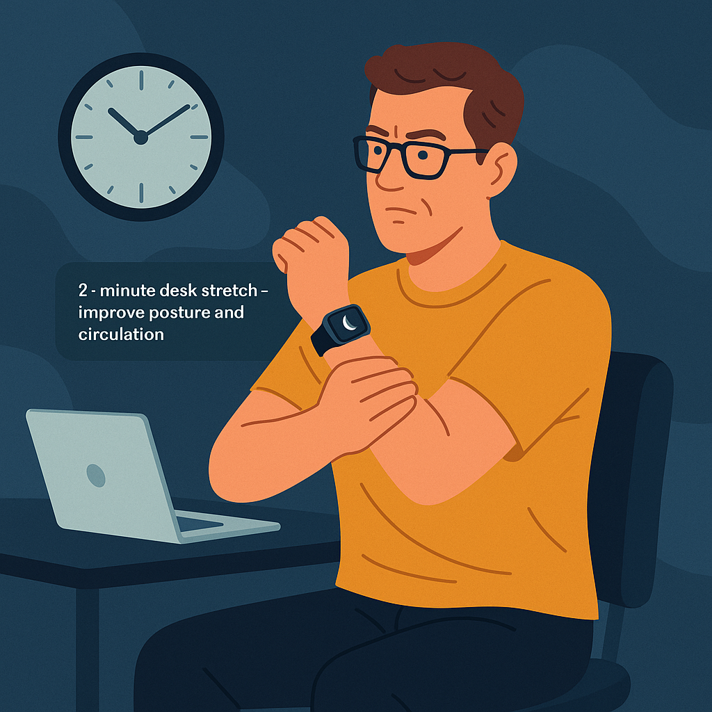
Fifteen minutes before his next meeting, Jarno is sitting at his desk after an intense video call. He feels stiff and stressed, and his calendar shows only a short break before he must join the next meeting. Knowing that small movements help him stay focused, he flicks his wrist and opens the MoveIt app on his smartwatch.
A suggestion appears:
“2-minute desk stretch – improve posture and circulation.”
He taps Start, and the watch guides him through simple, seated movements he can complete without leaving his desk. After finishing the short routine, he feels clearer and more energized and proud that he managed to do something for his health despite his tight schedule
Ideation
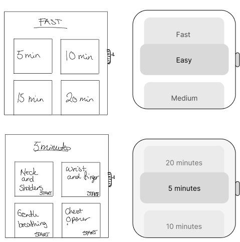
The design process began with exploring the best possible layout for both mobile and smartwatch. In the early sketching phase, simple boxes were used to map out content areas, helping the team focus on structure, hierarchy, and essential elements. The goal at this stage was to identify what needed to be prioritized on each device and to ensure that all interface elements would be readable and easy to tap, especially on the smaller smartwatch screen.
As part of the ideation phase, the team considered usability differences between devices and worked to simplify interactions, keeping the designs clean, minimal, and intuitive.
NUF Method
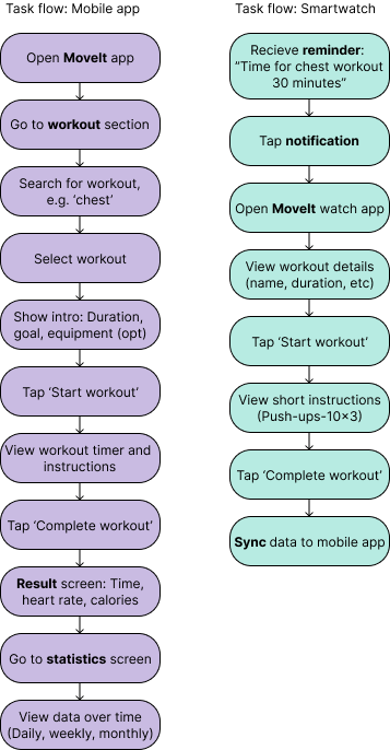
The task flow shows the specific steps Jarno must go through to start and complete a workout session in the MoveIt app. This linear process focuses on the core task and assumes that Jarno already knows what he wants to do. It only includes the necessary screens and actions that lead him to the goal without distractions.
Although Jarno can start and finish workouts from both the mobile app and the smartwatch, it is sufficient to do it from just one device, as they synchronize in real time.
Task flow
To evaluate and refine ideas, the team applied the NUF technique. Each concept was scored from 1 to 5 across the categories of novelty, usefulness, and feasibility. This allowed for an objective comparison of multiple design directions.
The results showed that the “Let’s Go” concept stood out. It offered clear progression, strong structure, and smooth guidance through choices and workouts. While the “Progress Circle” concept had strengths in feasibility and a clean flow, it was ultimately less useful for users seeking a more engaging experience.
Through the NUF evaluation, “Let’s Go” emerged as the most balanced and practical solution for both mobile and smartwatch, demonstrating a structured and insight-driven problem-solving approach.
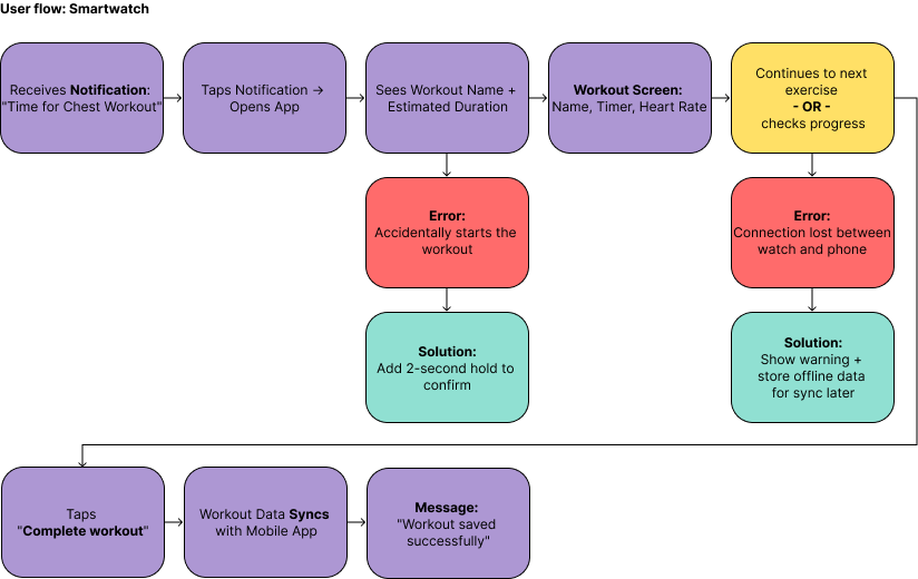
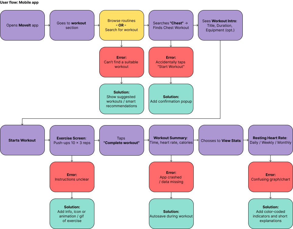
User flow
The user flow illustrates the different paths Jarno can take through the app based on his choices, needs, and potential errors. Unlike the linear task flow, the user flow includes alternative routes, possible error situations, and how the system responds.
This provides a holistic view of the experience and shows how the app adapts to Jarno’s behavior helping him stay consistent with his workouts, even on busy days


Design choices
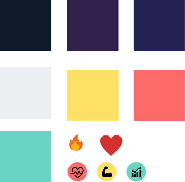
Contrast and colour choices
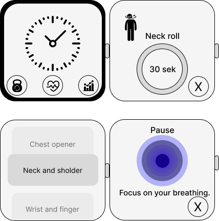
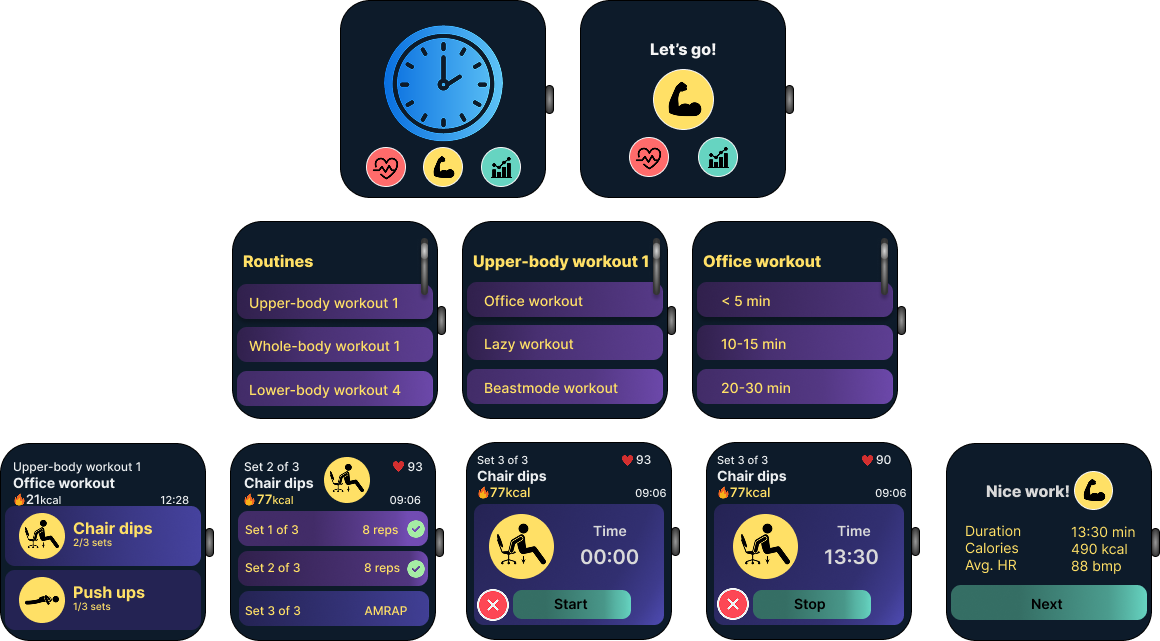
When designing for the smartwatch screen, high-contrast, glanceable colours on dark backgrounds were prioritised. Clearly differentiated colours help users instantly identify interactive elements, which reduces cognitive load during quick interactions. Wearable interfaces often use slightly muted colours to keep text and icons readable in different lighting conditions. These principles guided the choice of vibrant highlights combined with neutral backgrounds, ensuring that Jarno can easily track his workouts and health data at a glance.
Scroll-based layout for the watch
The team discovered that adapting the mobile layout directly to the watch was not user-friendly. Buttons became too small, and content felt compressed. By shifting to a scroll-based layout, the app allowed larger elements, better readability, and easier tap targets. This also made meaningful use of the watch’s side button or crown, enabling smooth scrolling through the interface.
Readability and tap targets
Because the smartwatch has a much smaller screen, many original elements became too small and difficult to tap in the low-fidelity stage. To improve usability, interface elements were increased in size to ensure they were easy to read and interact with. This adjustment was essential to create comfortable and accessible touch interactions on such a limited surface.
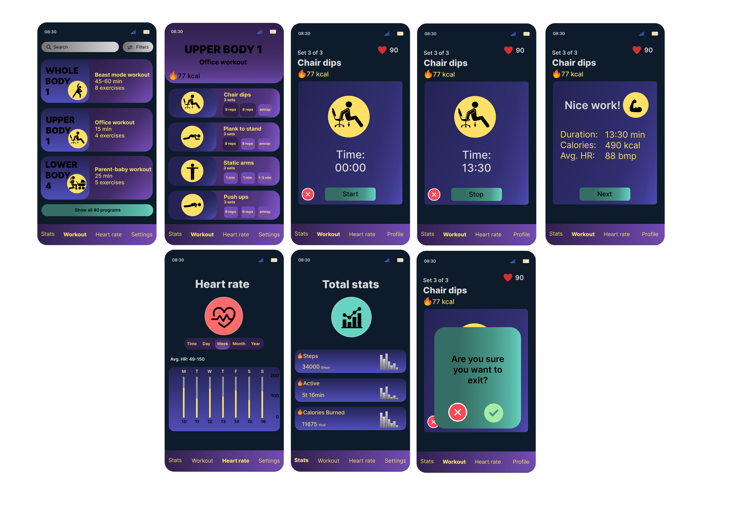
Consistency between mobile and smartwatch
After optimising the smartwatch layout, the mobile version was adjusted to match in both structure and interaction patterns. Consistency across platforms reduces cognitive load and makes the experience more intuitive. By mirroring key elements and adopting similar scroll-based navigation, the app feels recognisable and cohesive whether Jarno uses his phone or watch.
Low-fi → Hi-fi Development
-
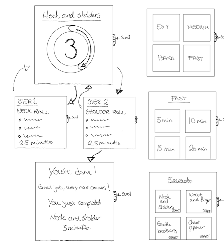
The design process began with simple low-fidelity sketches to explore structure and hierarchy for both mobile and smartwatch. In the earliest drafts, content areas were represented with basic boxes to keep the focus on usability and essential elements. These wireframes helped identify what needed to be included on each device and highlighted the functional limitations of the smartwatch’s smaller screen.
-
During testing of the low-fidelity smartwatch layout, it became clear that the original elements were too small to read and tap comfortably. This insight led to a major improvement: the layout was redesigned into a scroll-based structure. Larger components made interactions more natural, and the watch’s side button or crown could now be used to scroll smoothly through content.
As the smartwatch layout improved, the mobile version was also updated to reflect the same structure. This created a more consistent and intuitive experience across platforms, reducing cognitive load for the user.
-
The team focused on simplifying the interface while maintaining usability. On both devices, unnecessary complexity was removed, and the layout was refined to support clarity, quick decision-making, and an engaging workout experience. Each iteration aimed to make interactions smoother and the design more accessible, especially for fingertip interaction on the smartwatch.
These refinements show how insights from early wireframes directly shaped the high-fidelity prototypes, demonstrating an iterative UX process grounded in usability and consistency.
Final solution
“From wrist to phone, one smooth flow that keeps movement simple and achievable.”
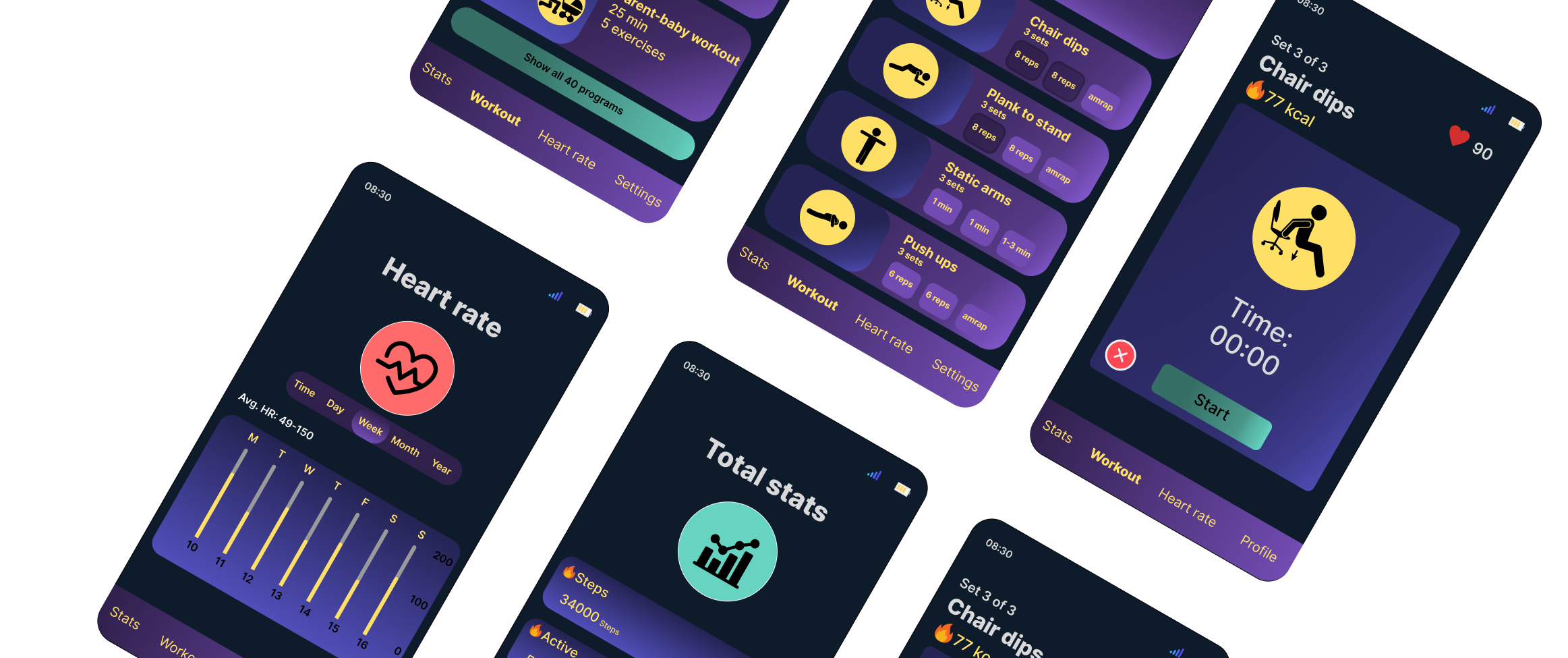
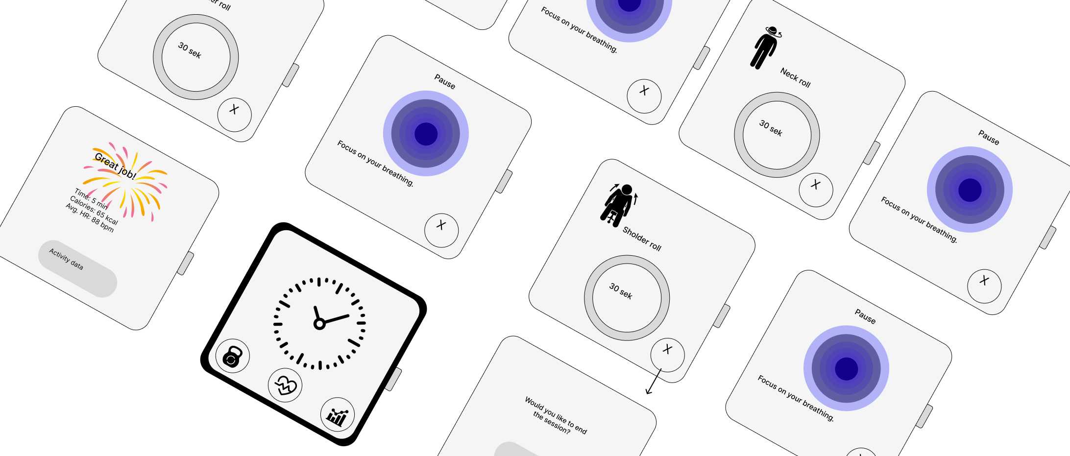
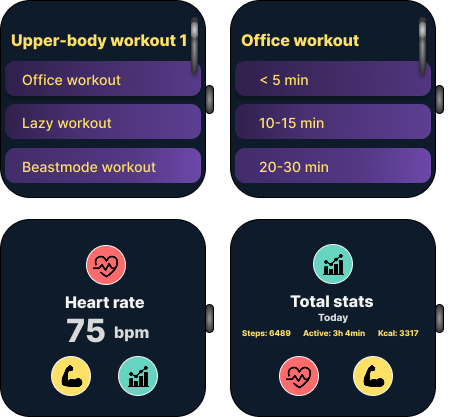
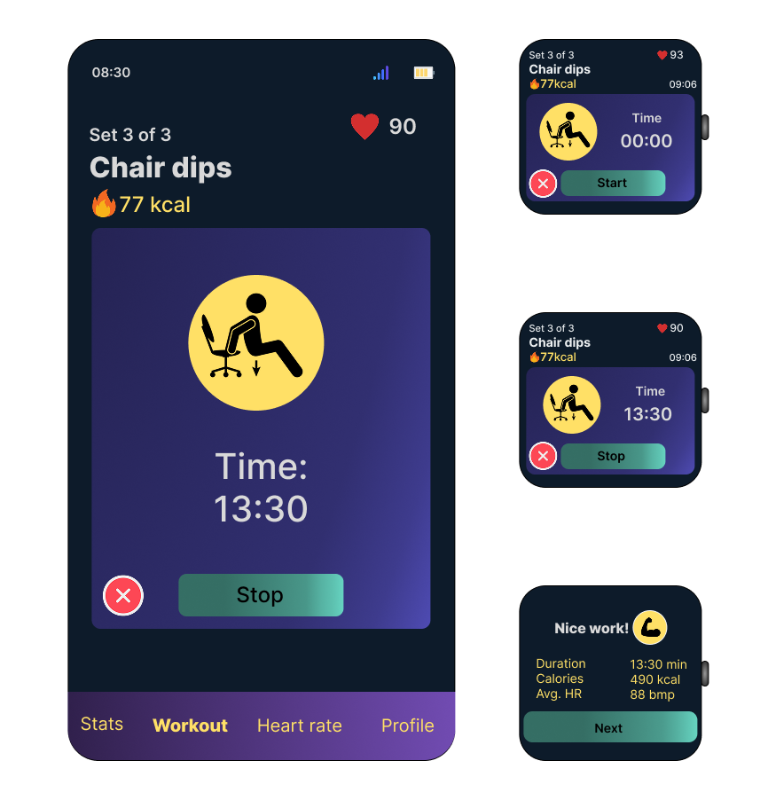
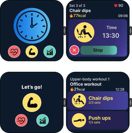
The high-fidelity prototypes show the final visual design for both the smartwatch and mobile versions of the MoveIt app. These screens demonstrate the refined layout, colour choices, interaction patterns, and the overall consistency across devices. The focus is on clarity, motivation, and guiding the user smoothly through each workout
The final design provides a clean, intuitive experience that works seamlessly across both devices. The smartwatch interface uses high-contrast colours and large, scrollable elements, making quick interactions effortless. The mobile layout mirrors these structures, ensuring consistency and easy recognition. The chosen design direction, “Let’s Go,” supports Jarno’s fast-paced lifestyle through clear visual hierarchy, guided progression, and real-time workout tracking. Overall, the final solution delivers a user-centred and accessible fitness experience designed to help Jarno stay active with minimal effort.
-
Scenario:
I created the scenario for the assignment to highlight everyday challenges faced by a typical MoveIt user. The scenario helped define when and how the user interacts with the app across both smartwatch and mobile, and clarified the need for quick, equipment-free workouts that fit into a busy schedule. This narrative guided the design decisions by grounding them in realistic use situations.Wireframes:
I sketched the initial wireframes for both the smartwatch and mobile versions. These early layouts explored how key features such as quick workouts, timers, progress tracking, and navigation could be structured on two different devices. We reviewed the sketches together as a group and decided which versions best supported consistency, clarity, and usability across screens.
In addition to the initial concepts, I assembled the coherent wireframe sets for both devices, ensuring alignment in interaction patterns, component usage, and visual structure.Color palette:
I selected the colors used throughout the MoveIt app on both the smartwatch and mobile designs. The palette was chosen to support visibility, contrast, and motivational energy while maintaining a clean and minimal aesthetic. Ensuring that the colours worked consistently across two device types was a key priority in the design process.Icons:
I identified recognizable icons that were used consistently across both platforms. The icons were selected to support fast recognition and simple navigation, especially on the smartwatch where screen space is limited. A unified icon style helped maintain a coherent visual language between the two versions of the app.Prototype:
I created the prototypes for both mobile and smartwatch, producing low-fidelity versions for early structural testing and high-fidelity versions for the final visual design. These prototypes demonstrated how interactions, navigation flows, and workout features functioned across devices. They also provided the foundation for evaluating consistency and usability in a cross-device fitness experience. -
A key strength of the project was the ability to adapt the design effectively across both mobile and smartwatch platforms. Early sketches and low fidelity wireframes supported the identification of essential elements and the creation of a clear structure. The NUF technique also proved valuable, as it enabled an objective comparison of multiple ideas and supported the selection of the “Let’s Go” concept, a design direction characterised by strong progression, structure, and user guidance. This resulted in a solution that aligned closely with Jarno’s needs, particularly the preference for simple, non disruptive workouts.
-
The most significant challenge emerged when adapting mobile layouts directly to the smartwatch format. Elements that functioned well on larger screens became too small and difficult to interact with, making the initial design unsuitable for a wearable device. This required substantial adjustments to ensure readability, appropriately sized tap targets, and functional interactions on a significantly smaller surface.
-
The process emphasised the importance of designing specifically for each device rather than simply scaling layouts. The smartwatch required prioritisation, simplification, and scroll based navigation to support a natural and comfortable user experience. The use of the NUF method also reinforced the value of structured decision making, as scoring concepts revealed clear strengths and weaknesses and supported the selection of the most balanced solution.
-
With additional time, further refinement of the smartwatch interactions could have been explored, particularly by simplifying the interface while maintaining core functionality. Additional iteration on both versions could have revealed further opportunities to streamline the design, supporting optimal usability across devices.
Reflection
-
Apple Inc. (2024). Color. Apple Developer Documentation.
Android Developers (2023). Color – Wear OS UI Style Guide.
Flaticon (2025). Flaticon Resource Library.
Google (2024). The Color System. Material Design.
Nielsen Norman Group (2021). The Visual Principle of Contrast in UI Design [Video].
Noroff (2024). UX Design for Mobile – Module 1.
Noroff (2024). UX Design for Mobile – Module 2.
Noroff (2024). UX Design for Mobile – Module 3.
W3C (2018). Web Content Accessibility Guidelines (WCAG) 2.1.